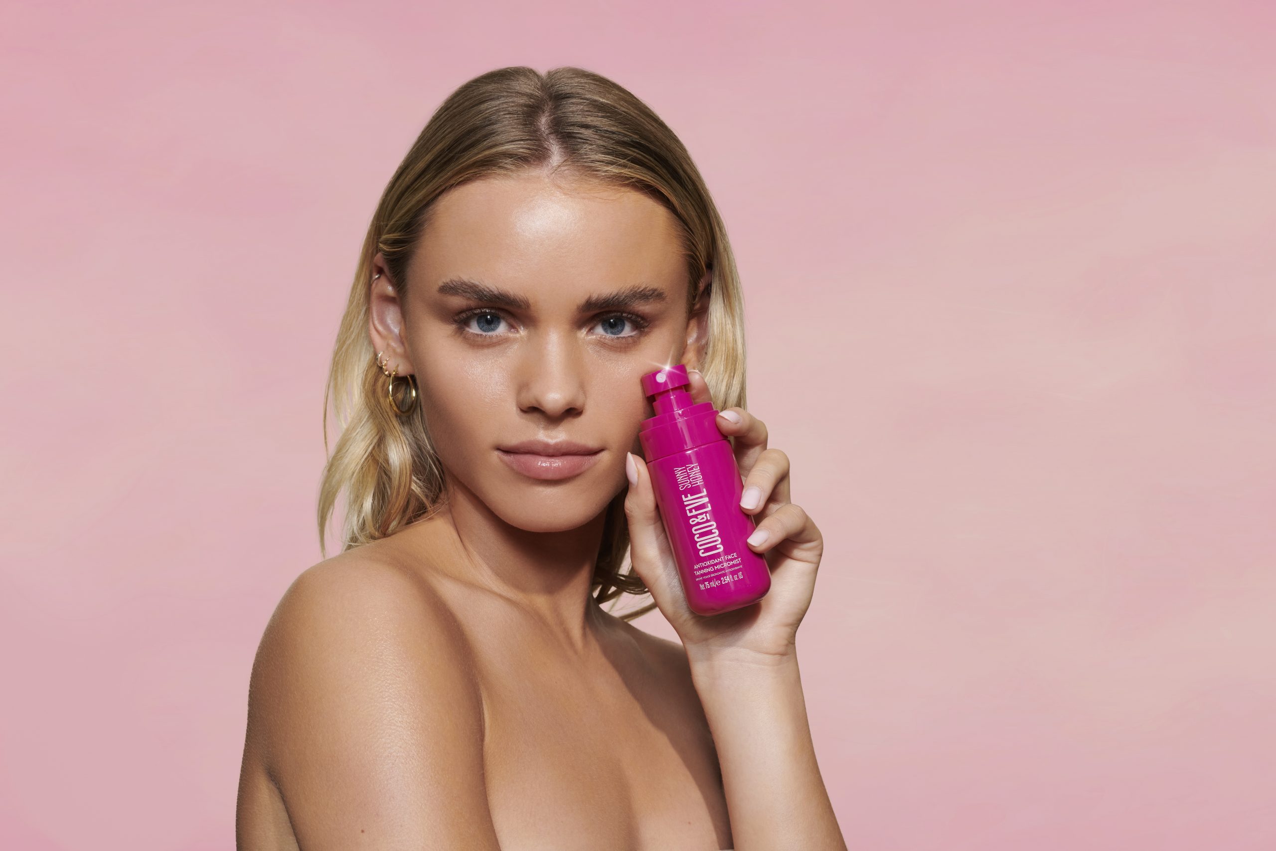
Gisou
/
Teeez Cosmetics
Brand Identity.
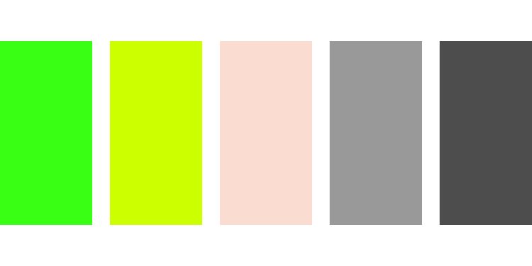
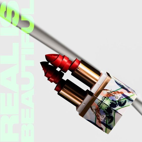
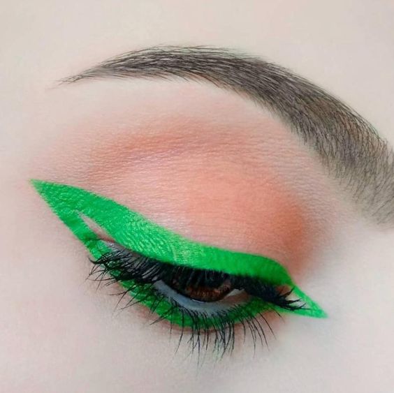
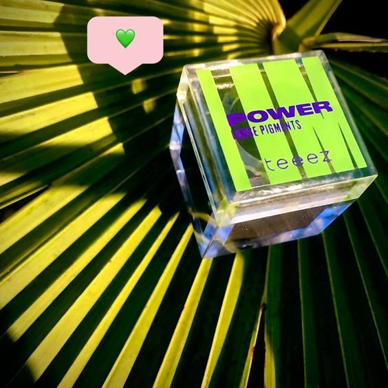
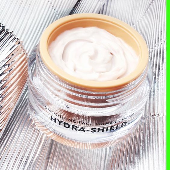
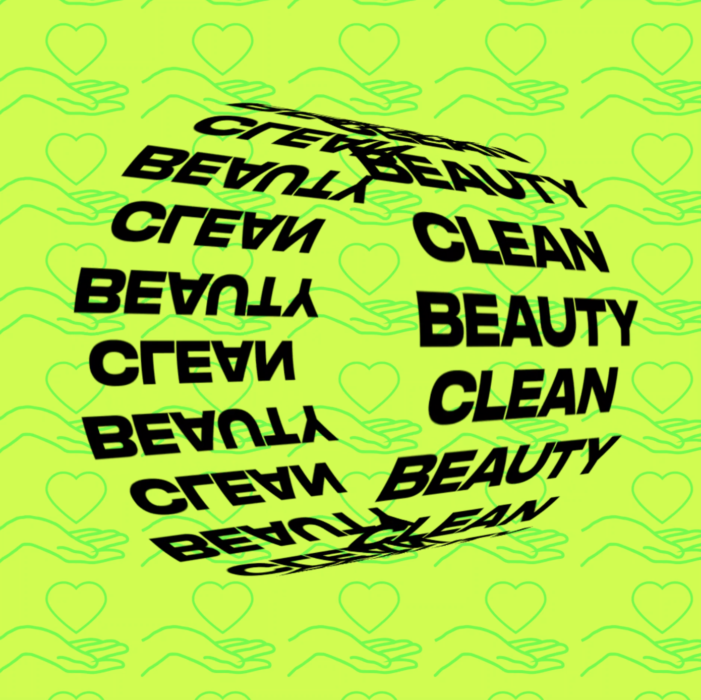
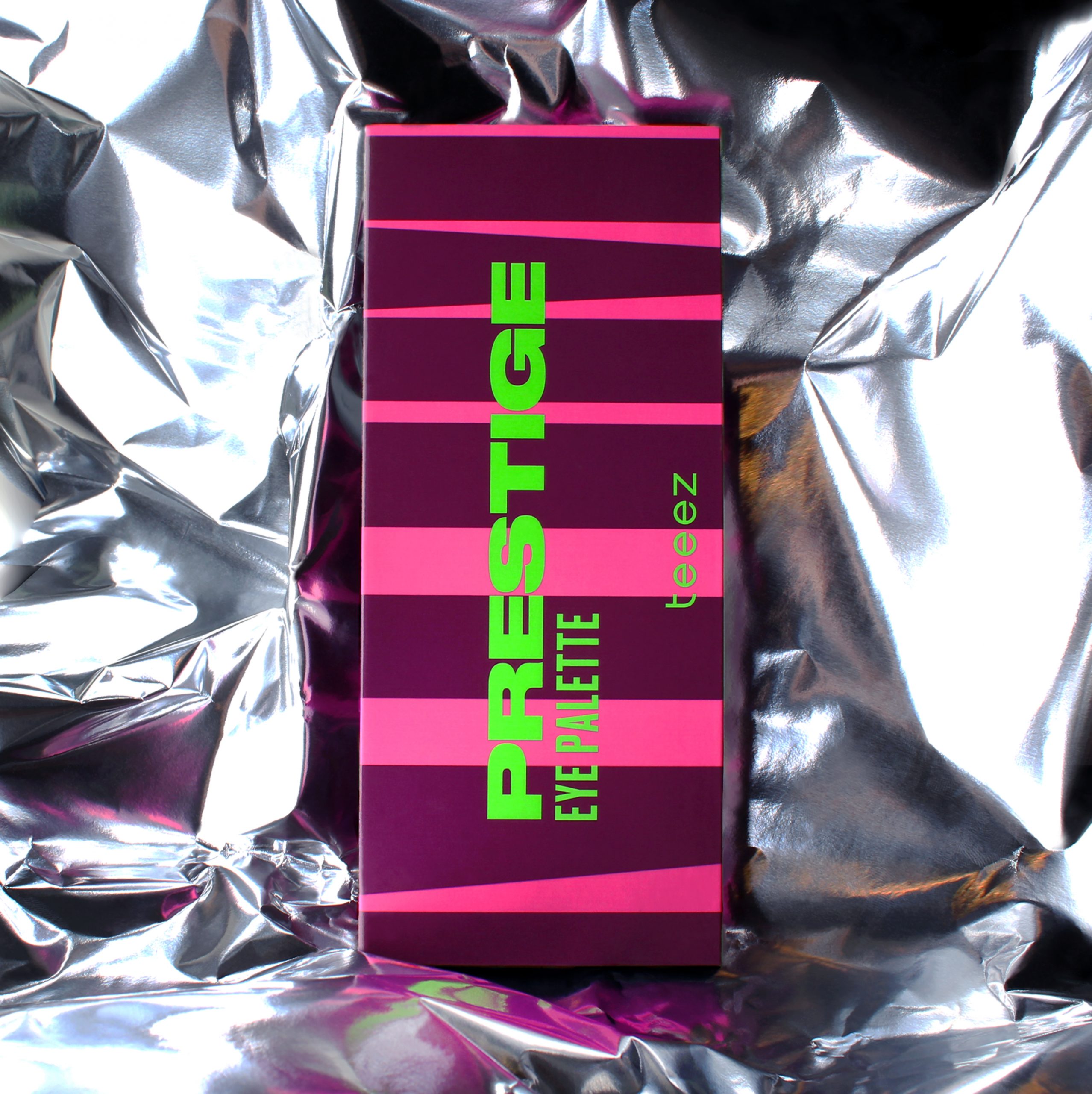
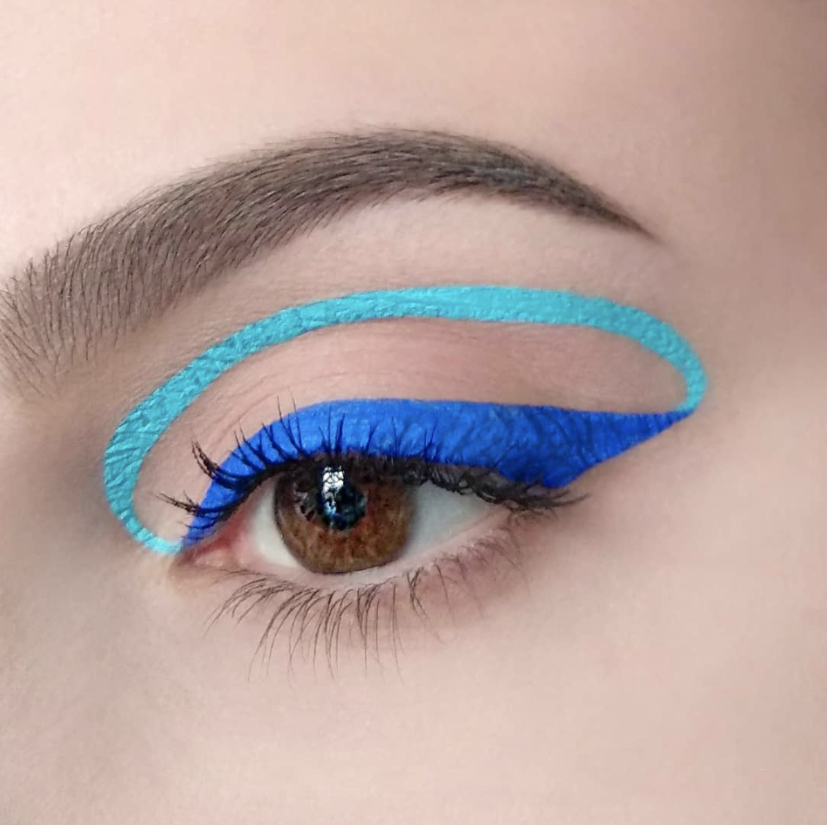
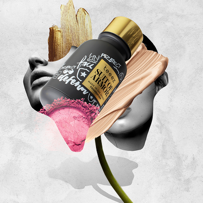
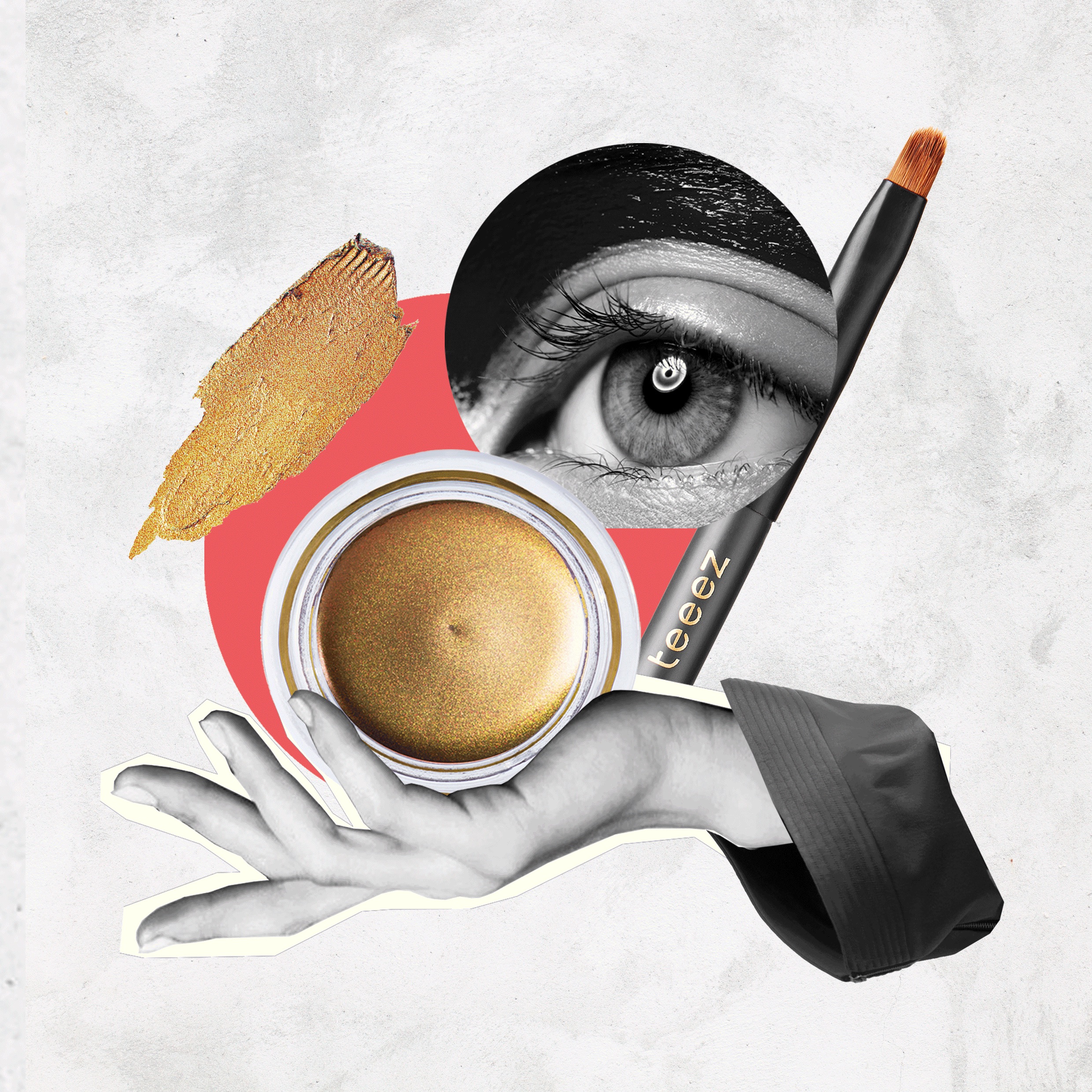
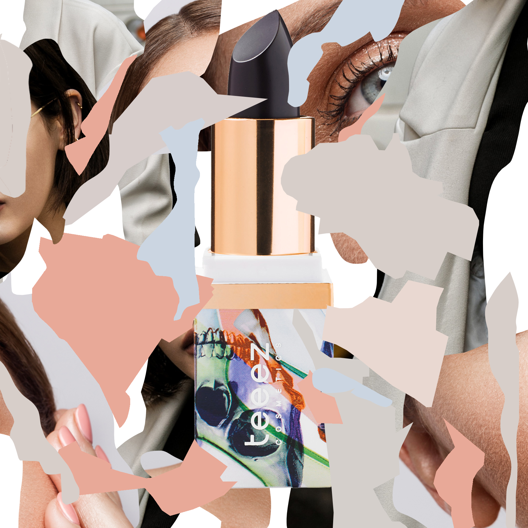
Dutch cosmetics company Teeez Cosmetics received a brand refresh with a dose of modern color, bold typography and playful messaging. Founded on the principles of clean and natural beauty, neon and lime green were introduced to the brand's core palette of
gray and pink as a nod to the vibrancy of nature. Product photography implemented organic ingredients and graphic angles, combined with typography that reflected the updated aesthetic.
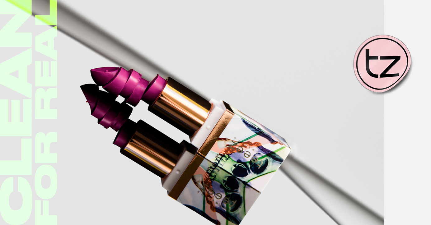
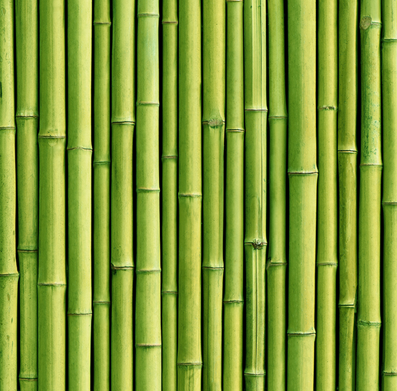
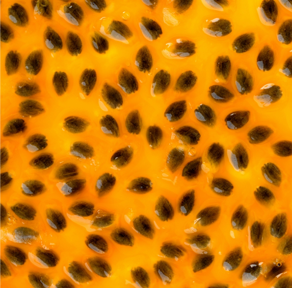
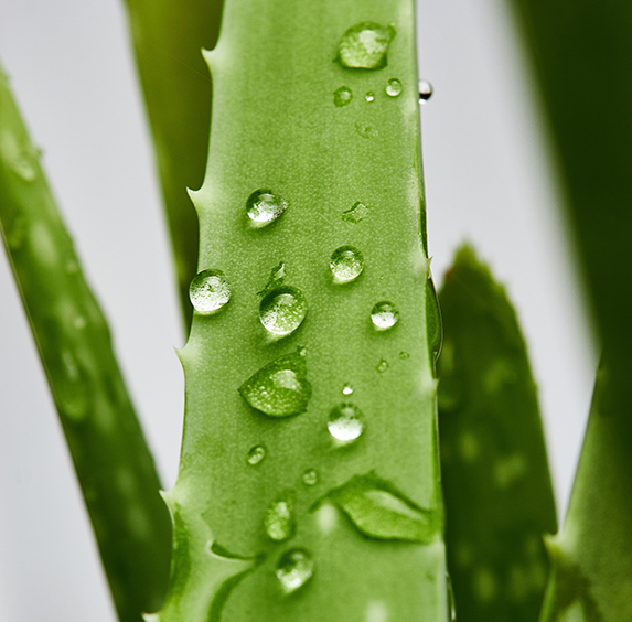
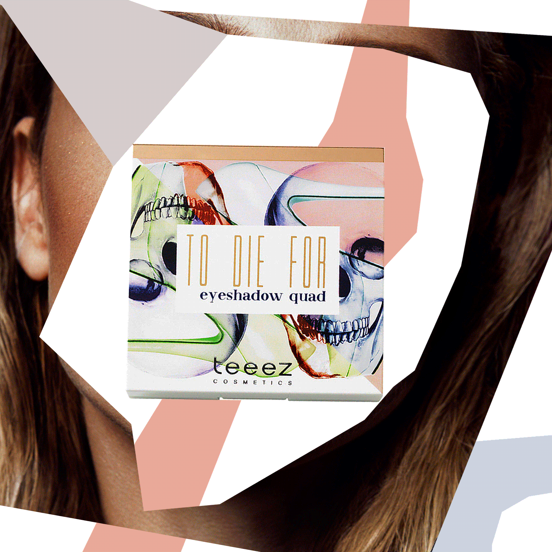
COLOR
The Teeez brand refresh drew upon the colors found in aloe vera, passionflower and bamboo.
TYPOGRAPHY
Druk's heavy and exaggerated typeface embodied the brand's bolder identity. Grounded by Futura typography becomes agile and adaptable to any media.
Druk Wide
Futura PT Demi
Futura PT Bold
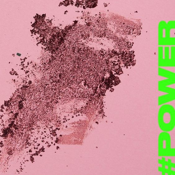
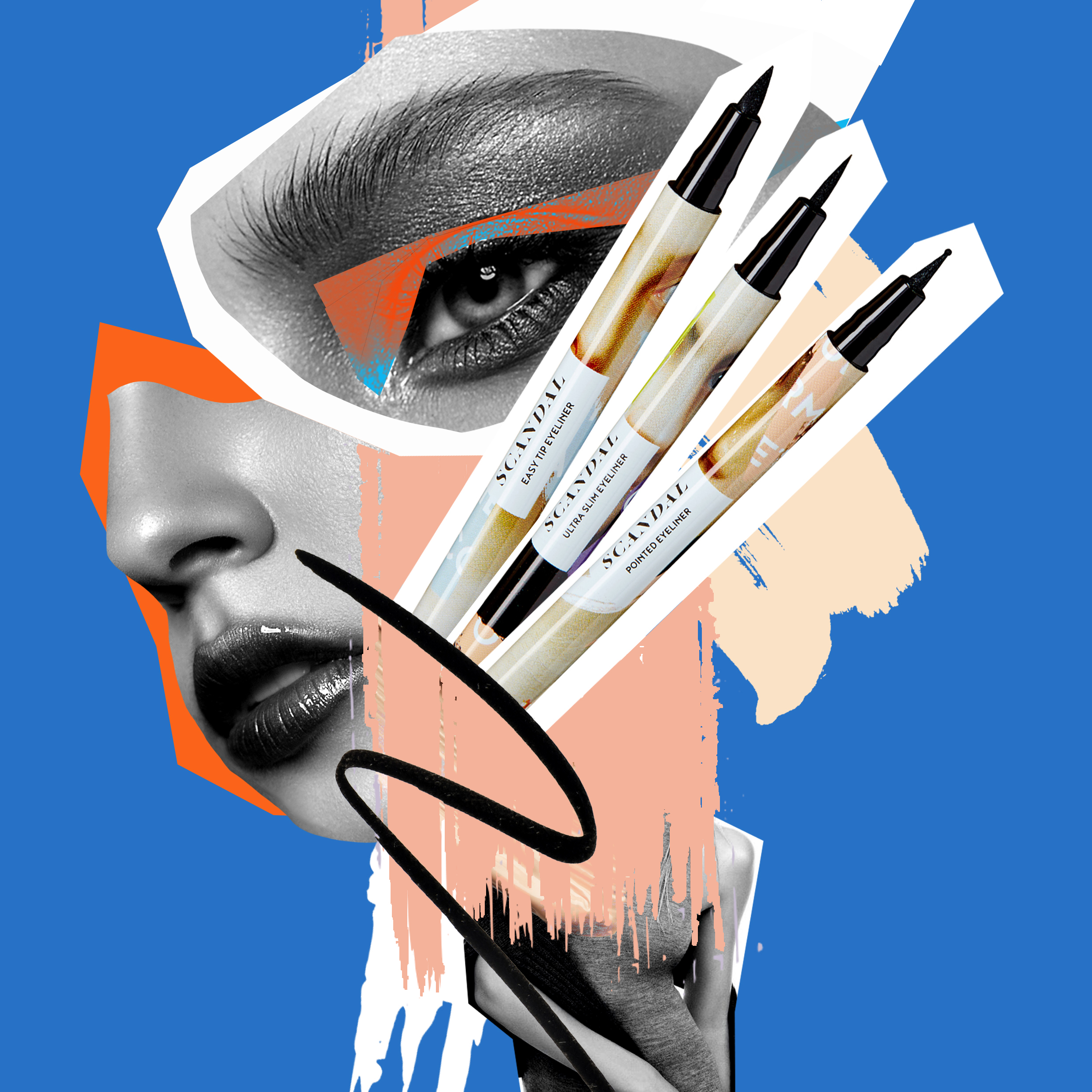
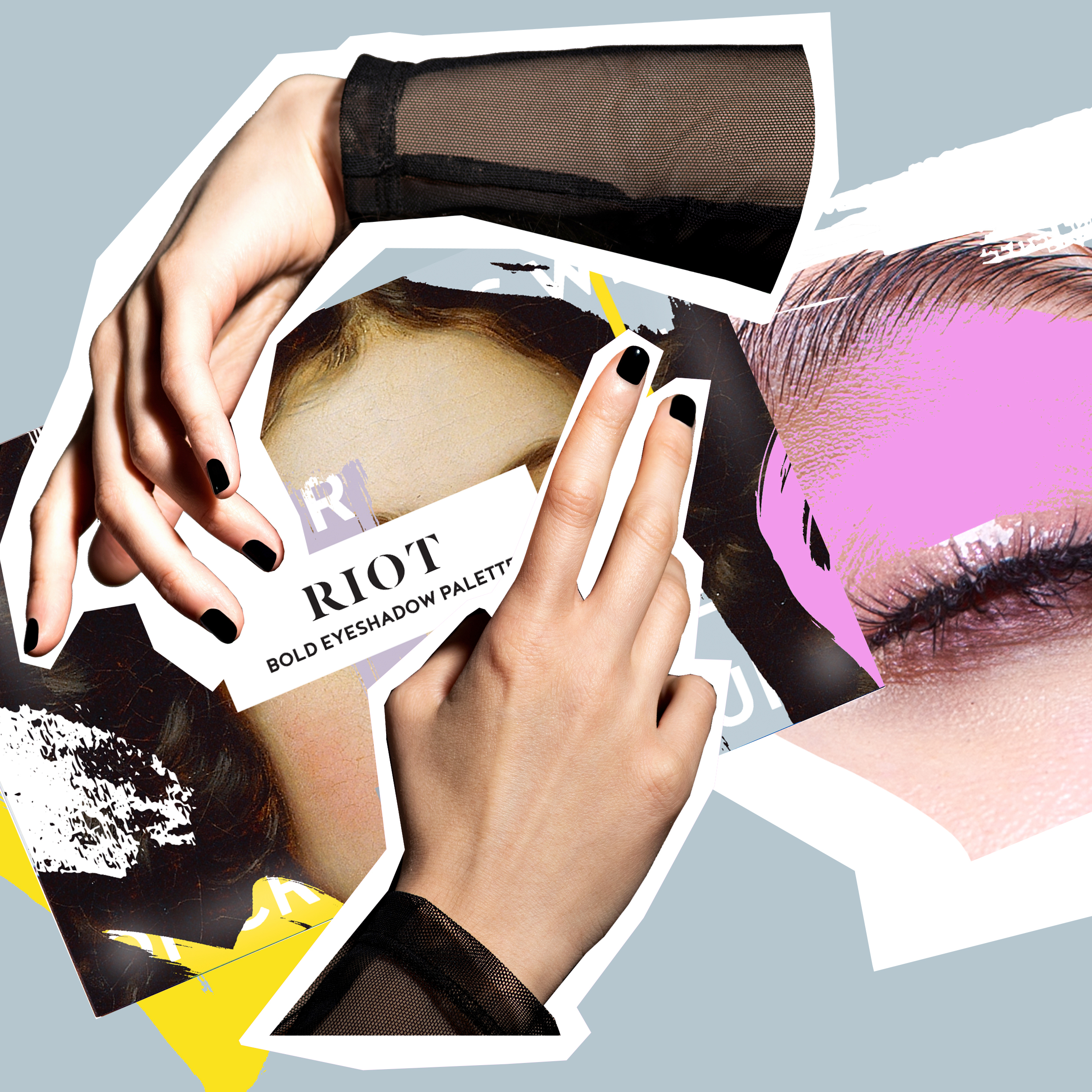
SOCIAL MEDIA
The brand palette and playful messanging rolled out across social media channels promoting a modern and youthful vision.
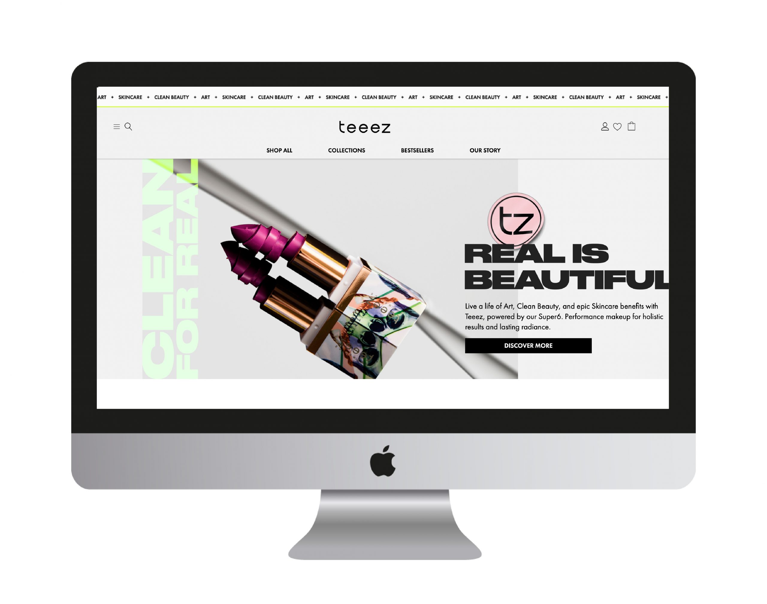
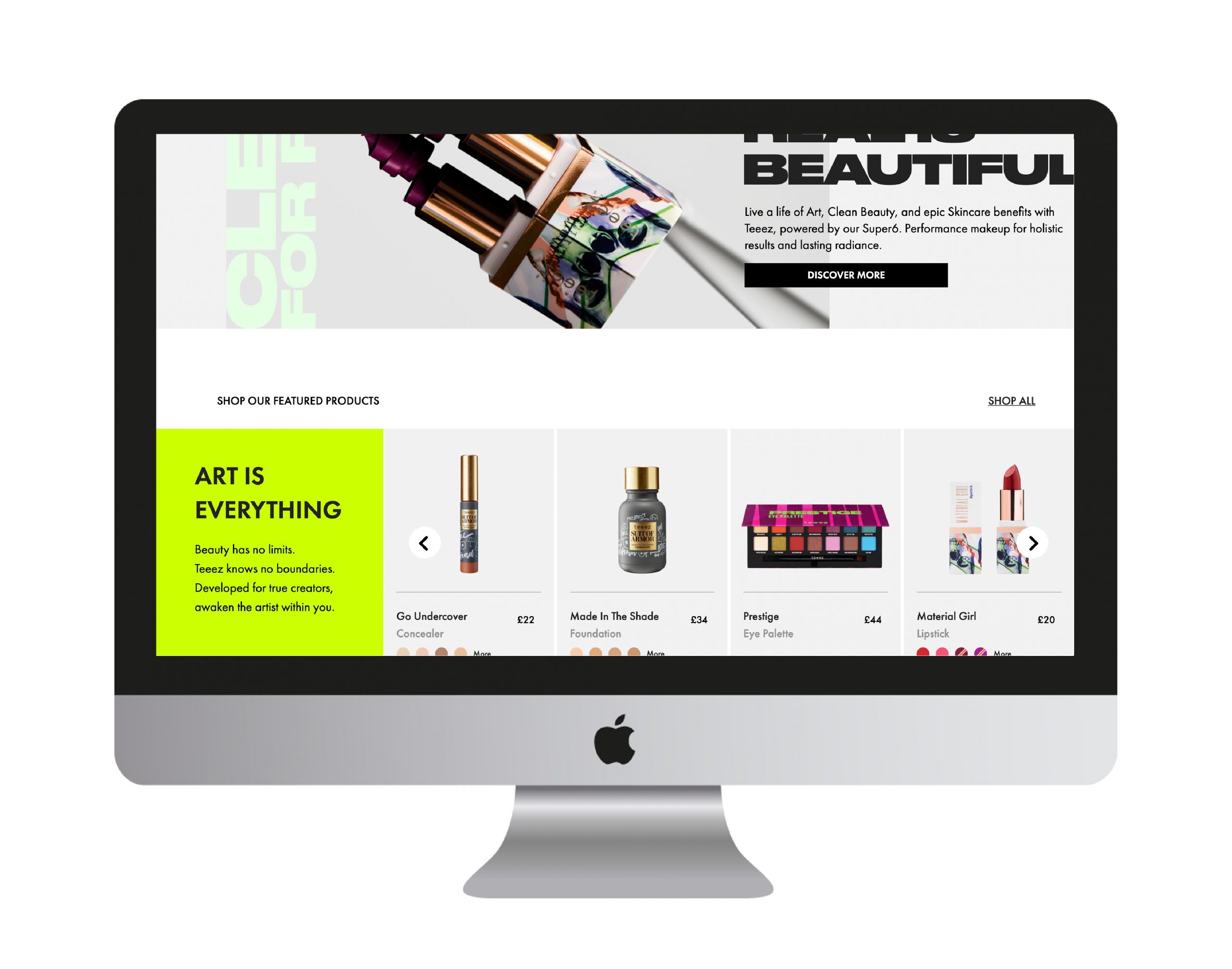
WEBSITE
Teeezcosmetics.com design features elements from the brand refresh, including a more sophisticated palette and introduction of neon and lime green.
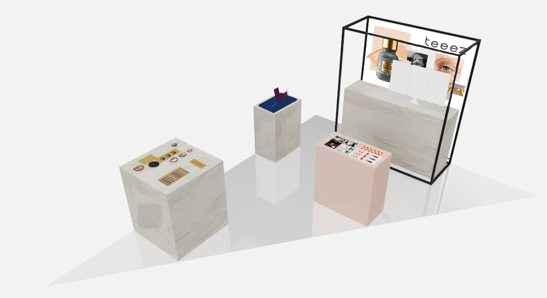
TEEEZ POP UP
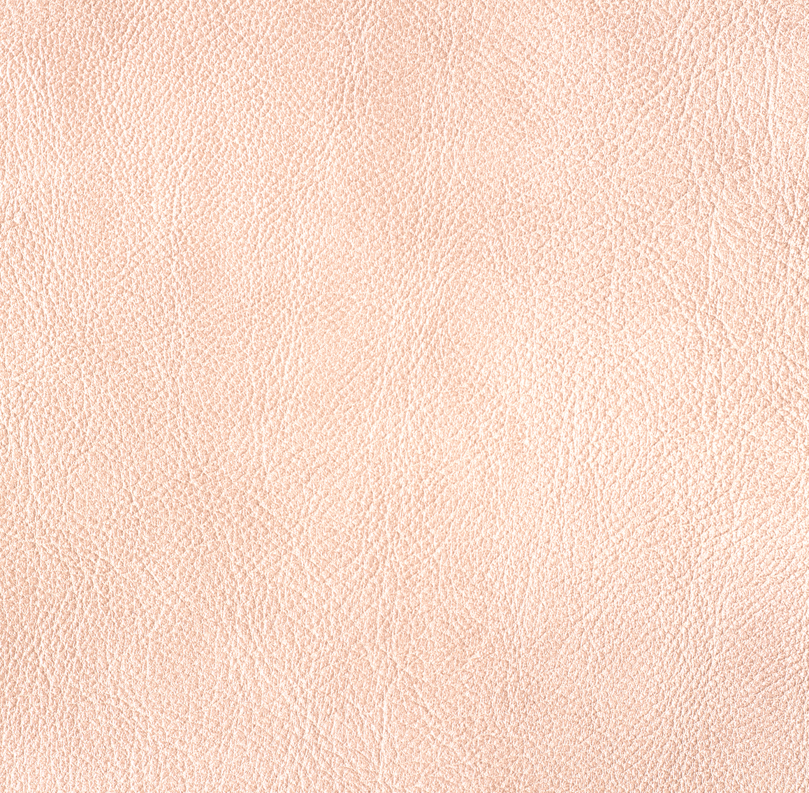
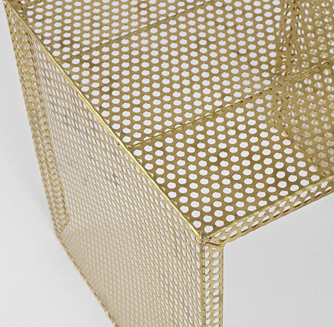
The Teeez pop-up store in El Corte Ingles in Barcelona, Spain combined the natural brand elements of raw leather, textural concrete and brand elements.
PROMOTIONAL
Social media and in-store promotional signage.
Teeez Cosmetics
Brand identity. In-store marketing. Social + digital creative content.
Creative Director Ashley Farbo
Designer Myrelle Nieuwenhuys
Designer Flora Trejes
Designer Mathieu Cremers